
What is prepress? Prepress is everything that happens between the moment a printer receives your artwork and the moment ink actually touches paper. It covers file preflight, color conversion, imposition, proofing, quality control and, for offset work, the output of printing plates. In short: prepress is the stage where a design file becomes a production-ready file.
On the designer side, prepress feels like a formality. On the printer side, it is the single biggest source of delays. Files come in with RGB photos, 72 dpi logos, missing fonts, no bleed and 380% ink coverage, and every one of those issues means an email, a re-export and a lost day in the schedule.
This article is written from the other side of the handoff. Below you will find the exact 9 checks our prepress team runs on incoming artwork, what breaks when each one is skipped, and concrete examples of the kind of files we send back.
Prepress in one paragraph
The printing workflow has three stages. Prepress prepares the file. Press puts ink on the substrate. Postpress (also called finishing) handles cutting, folding, laminating, binding, die-cutting and packing. Prepress is the only stage where mistakes are still cheap to fix. Once plates are burned or the press is running, a color error costs paper, ink, machine time and a delivery date.
| Stage | What happens | Cost of an error |
|---|---|---|
| Prepress | Preflight, color conversion, imposition, proofing, plate output | Minutes of work |
| Press | Offset, digital or wide-format printing | Wasted stock, ink and press time |
| Postpress | Cutting, folding, laminating, binding, die-cutting | Full reprint of the job |

The 9 prepress checks, one by one
1. Color mode conversion: RGB to CMYK (and spot colors)
Screens emit light and use RGB. Presses lay down ink and use CMYK, plus any spot colors you specify. Those two color spaces do not overlap perfectly. Bright RGB greens, electric blues and neon oranges simply do not exist in four-color process ink.
What goes wrong when it is skipped: the RIP converts your RGB values automatically using a generic profile. That vivid #00B140 brand green comes out muddy, and nobody notices until the client holds a printed brochure next to their website.
Real example: a 24-page catalogue arrived with 60% of the product photos still in sRGB and three images in Adobe RGB. Converted blindly, the packaging shots shifted enough that two SKUs looked like different products. The file went back for a controlled conversion with the correct output profile.
- Convert to the CMYK profile your printer actually uses. For coated stock in Europe that is usually PSO Coated v3 (FOGRA51) or ISO Coated v2; for uncoated, PSO Uncoated v3 (FOGRA52).
- Check that spot colors are named consistently. “PANTONE 485 C”, “Pantone 485C” and “Red” create three separate plates.
- Delete unused swatches before export. Ghost spot channels are one of the most common preflight warnings we see.
- If a color must be exact (brand identity, packaging), specify it as a spot color rather than hoping a CMYK build will match.
2. Resolution and image quality
Resolution is only meaningful at the final placed size. A 300 dpi image scaled to 400% in InDesign is a 75 dpi image on press.
| Product | Recommended effective resolution |
|---|---|
| Brochures, catalogues, magazines | 300 dpi |
| Packaging and labels | 300 to 400 dpi |
| Line art / bitmap logos | 1200 dpi |
| Posters viewed from 1 to 2 m | 150 to 200 dpi |
| Large format banners, viewed from 5 m+ | 72 to 100 dpi at final size |
Real example: a client sent a roll-up banner design where the logo had been copied from the company website. On screen at 25% zoom it looked fine. At 850 mm wide it was a 96 pixel PNG with visible JPEG artifacts and a white halo. We asked for the vector original, which existed, but nobody had looked for it.
- Use the Links panel in InDesign to read effective ppi, not actual ppi.
- Never upscale a low-res raster and call it fixed. AI upscaling can help on photos, but it invents detail on logos and text.
- Logos, icons and line work should be vector whenever possible.
- Avoid images pulled from web pages, social media exports or presentation slides.
3. Bleed, trim and safety margin
Guillotines and die-cutters have tolerance. If your background stops exactly at the trim line, a 0.5 mm shift produces a white sliver along the edge.
- Bleed: 3 mm on every side for standard commercial print, 5 mm for perfect-bound covers and most packaging.
- Safety margin: keep text and critical elements at least 3 to 5 mm inside the trim line.
- Extend the actual image content into the bleed, do not just stretch a white box.
- For folded work, remember that inner panels of a roll fold must be slightly narrower.
Real example: a set of business cards with a full-bleed dark navy background exported without bleed. On a 500-card cut, roughly 60 cards showed a hairline of white paper on one edge. The design was perfect. The export preset was not.
4. Fonts: outline them or embed them
Fonts are the classic handoff failure. If a font is neither embedded nor converted to curves, the RIP substitutes it, and your carefully tracked headline becomes Courier or Minion.
Outline or embed?
- Vector artwork (Illustrator, packaging dielines, logos): convert text to outlines. It removes all licensing and substitution risk.
- Multi-page layouts (InDesign): keep text live and export to a PDF/X standard that embeds fonts. Live text allows last-minute typo fixes and keeps the PDF searchable and accessible.
- Always keep an editable master file with live text before you outline anything.
- Watch out for fonts with embedding restrictions. Some licenses block embedding entirely and the export will fail or flatten badly.
Real example: a pharmaceutical carton arrived with the dosage text set in a variable font that would not embed. The PDF opened fine on the designer’s machine because the font was installed locally. On our RIP the entire ingredient panel reflowed and lost two lines. On a regulated product, that is not a cosmetic issue.
5. Overprint settings
Overprint tells the press to print one ink on top of another instead of knocking a hole in the underlying color. Used deliberately it is powerful. Left on by accident it is destructive. A comparable breakdown sits on smartpress.com.
The two classic disasters:
- White set to overprint. White ink does not exist in CMYK process printing. A white object set to overprint simply disappears from the printed sheet. Your reversed-out logo vanishes into a solid black box.
- Large color areas accidentally set to overprint. A cyan panel over a magenta background turns into an unplanned violet.
Real example: an annual report cover with a white wordmark over a rich black field. The wordmark had inherited overprint from a copied object. The soft proof looked correct because the designer had Overprint Preview turned off. Our preflight flagged it, but had it slipped through, 3,000 covers would have printed as plain black rectangles.
- Turn on Overprint Preview in Acrobat and InDesign. Keep it on permanently.
- Rule of thumb: only 100% black text and thin black rules should overprint. Everything else knocks out unless you have a reason.
- Check the Output Preview / Separations panel in Acrobat Pro before sending.
6. Trapping
Trapping is a tiny deliberate overlap between adjacent colors that hides misregistration on press. Sheets stretch, blankets shift, web presses run fast. Without trapping, a 0.1 mm registration error shows as a white gap between two colors.
- For most commercial offset work, the printer applies trapping in prepress. Do not build your own unless asked.
- For flexo packaging and label work, trapping values are larger and substrate-dependent. Again, leave it to the prepress team.
- What you can do: avoid designs that depend on hairline registration, such as 0.25 pt outlines in one color sitting exactly on the edge of another color.
- Keep small reversed-out text out of areas built from three or four inks. One color slightly off register makes 6 pt reversed text unreadable.
Real example: a food label with a red spot color background and white reversed serif text at 5.5 pt. On a flexo press, the trap needed to keep the color solid also closed up the thin serifs. The fix was a small type change agreed before plates were made, not after.
7. Total ink coverage (TAC)
Total Area Coverage is the sum of C + M + Y + K in the darkest area of your file. Too much ink does not dry, offsets onto the next sheet, blocks in the stack and can crack on folds.
| Substrate / process | Typical maximum TAC |
|---|---|
| Coated offset (sheetfed) | 300% to 330% |
| Uncoated offset | 260% to 300% |
| Newsprint / coldset web | 220% to 240% |
| Digital toner | 240% to 280% |
Real example: a dark, moody hotel brochure supplied with shadows at 100C 100M 100Y 100K, a full 400%. On uncoated stock the ink would have soaked, spread and set off. Correct profile conversion brought the same visual density down to 298% with almost no perceived difference.
Use Acrobat Pro’s Output Preview with Total Area Coverage turned on to spot hot zones instantly.
8. Black handling: rich black vs 100K
This one is small and it ruins more jobs than trapping does. Anyone digging further should read What is Pre-Press.
- Body text, small type, thin rules, barcodes: use 100% K only. A four-color black build on 9 pt text will show color fringing at the slightest misregistration.
- Large solid black areas: use a rich black build, for example 60C 40M 40Y 100K, so the area looks deep rather than washed-out grey.
- Never mix the two on the same page in a way that is visible. A 100K panel next to a rich black panel reads as two different colors.
- Check that black text imported from Word or Excel is not sitting at 91C 79M 62Y 97K, which is what an RGB black converts to.
Real example: a 96-page technical manual where every page of body copy converted from RGB black. Registration on a web press was within tolerance, but the text still looked soft and slightly brown. We reconverted all text to 100K before plating.
9. PDF export preset and standards
The last check protects the previous eight. Exporting with the wrong preset can strip transparency, downsample images to 100 dpi or drop your bleed.
| Preset | Transparency | Color | Best for |
|---|---|---|---|
| PDF/X-1a:2001 | Flattened | CMYK + spot only | Older offset workflows, publishers who demand it |
| PDF/X-4:2010 | Live transparency | CMYK, spot, ICC-managed | The default choice for modern print in 2026 |
| Press Quality | Live | May leave RGB | Acceptable, but not a verified standard |
| Smallest File Size | Flattened | RGB, heavy compression | Email only. Never send this to a printer. |
Whichever preset you use, verify these settings before you hit Export:
- Bleed: 3 mm on all sides, use document bleed settings
- Marks: crop marks on, offset at least 3 mm so they do not sit inside the bleed
- Images: no downsampling below 300 ppi, compression set to ZIP or high-quality JPEG
- Output intent: set to the CMYK profile agreed with your printer
- Layers: flattened or clearly named if the printer needs them (varnish, foil, white ink, dieline)
- No security or password protection, ever
Real example: a packaging file exported as “Smallest File Size” with a spot varnish layer. The preset converted the spot channel to CMYK, so the varnish would have printed as a grey box across the front panel. The file was 1.8 MB, which should have been the first warning sign.
The special layers printers need called out
If your job includes any finishing effect, prepress needs a separate, correctly built layer or channel:
- Dieline / cutting contour: vector path, 100% spot color, named clearly (for example “CutContour” or “Die”), set to overprint, on its own layer
- Spot UV or varnish: spot color at 100%, overprint on
- Hot foil and embossing: separate spot channel, no gradients, minimum line weight respected
- White ink (on transparent or metallic substrates): separate spot channel named “White”

Quick prepress checklist before you hit send
- All colors converted to the agreed CMYK profile, spot colors named consistently, unused swatches deleted
- Effective resolution 300 dpi at final size, logos in vector
- 3 mm bleed on all sides, 3 to 5 mm safety margin respected
- Fonts embedded or outlined, editable master saved separately
- Overprint Preview checked, no white or light objects set to overprint
- No hairline registration dependencies, trapping left to the printer
- Total ink coverage under the limit for the chosen substrate
- Small text and thin rules at 100% K, large solids in rich black
- Exported as PDF/X-4 with bleed, crop marks and correct output intent
Bonus check: open the exported PDF in Acrobat, zoom to 400%, and look at it as if someone else made it. Most errors are visible in 30 seconds if you actually look. Anyone digging further should read Prepress Terms Explained for Print Buyers.
How prepress works on our side
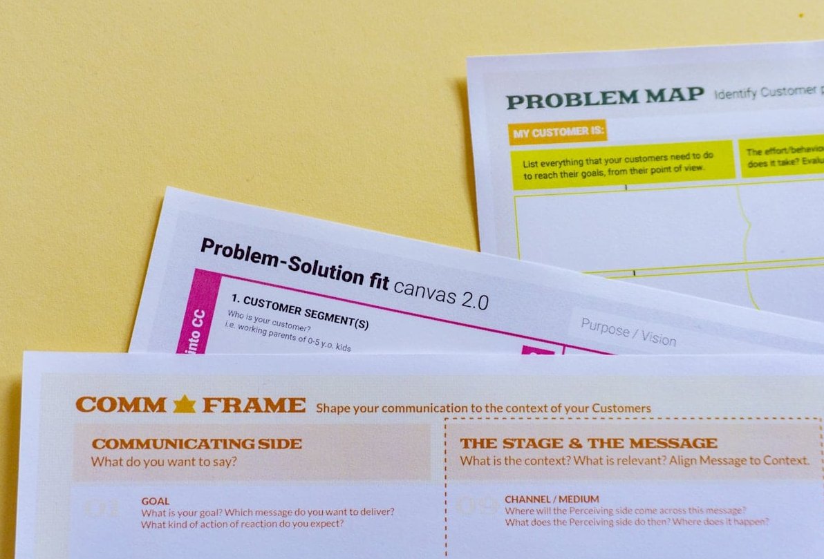
When your file arrives, it goes through automated preflight against a profile built for your specific job (substrate, press, finishing). Anything that fails is either corrected automatically within agreed tolerances or flagged back to you with an annotated report. Approved files are then imposed onto the press sheet, trapped, and output to plate or to the digital press. You receive a soft proof, and for critical color work a calibrated contract proof.
The better the incoming file, the shorter that loop. A file that passes all nine checks above typically clears prepress the same day. A file with RGB images, missing fonts and no bleed can add two or three days to the schedule, and the delay is almost never on the press.
FAQ about prepress
What is a prepress job?
A prepress job is the role of preparing incoming client artwork for production. A prepress operator or technician runs preflight, corrects color and technical issues, applies trapping, builds impositions, produces proofs and outputs plates or RIP-ready files. It sits between graphic design and machine operation, and requires both design software knowledge and press knowledge.
Is prepress a stressful job?
It can be. Prepress is the last checkpoint before money is spent on plates, ink and paper, so it carries responsibility, tight deadlines and frequent last-minute client changes. The upside is that it is systematic work with clear rules, and good automation and preflight profiles remove most of the guesswork.
What is the difference between prepress and printing?
Prepress is the file preparation and proofing stage. Printing (press) is the physical reproduction of that file onto paper, board, film or another substrate. Prepress happens on computers and plate-setters, printing happens on presses.
What does postpress mean in printing?
Postpress, or finishing, is everything after the ink is on the sheet: cutting, folding, creasing, laminating, spot UV, foiling, die-cutting, gluing, stitching, perfect binding and packing. Postpress requirements affect prepress decisions, which is why you should tell your printer about finishing before you build the file, not after.
Should I convert text to outlines or keep it live?
Outline text in vector artwork such as logos and packaging. Keep text live in multi-page documents and rely on PDF/X font embedding, so typos can still be fixed and the PDF stays searchable. Always keep an editable version with live text.
Is 300 dpi always required?
No. 300 dpi is the standard for material viewed at reading distance. Large format work viewed from several meters can be produced at 100 to 150 dpi at final size, while line art and barcodes may need 1200 dpi. What matters is the effective resolution at the final printed dimensions.
Which PDF standard should I use in 2026?
PDF/X-4 is the safe default for almost all commercial work. It preserves live transparency and ICC color management, which means fewer flattening artifacts and better color control. Use PDF/X-1a only if your printer or publisher specifically requests it.
Do I need to apply trapping myself?
Usually not. Trapping values depend on the press, the substrate and the ink, so the printer applies them in prepress. Your job is to avoid designs that rely on perfect registration.
Send us your files, we will preflight them
If you are unsure whether your artwork is production-ready, send it over before the deadline rather than on it. Our prepress team will run a full preflight, tell you exactly what needs to change, and give you the correct color profile and export settings for your specific job and substrate. It is faster for everyone, and it is the difference between a print run that goes right the first time and one that does not.