
• Home
  • What We Do
  • About Us
  • News
  • Contact
RGB vs CMYK: Why Your Colors Shift Between Screen and Print (And How to Fix It)

RGB vs CMYK: Why Your Colors Shift Between Screen and Print (And How to Fix It)

by Ernesto Orozco | Nov 8, 2026 | Uncategorized

You approve a design on screen. The blue is electric, the green glows, the orange pops. Then the printed sheet arrives and the blue leans purple, the green looks like moss, and the orange has lost its punch. Nothing went wrong at the press. The file was simply built...

What Is Prepress? The 9 Checks Every Designer Should Run Before Sending Files to the Printer

What Is Prepress? The 9 Checks Every Designer Should Run Before Sending Files to the Printer

by Ernesto Orozco | Oct 12, 2026 | Uncategorized

What is prepress? Prepress is everything that happens between the moment a printer receives your artwork and the moment ink actually touches paper. It covers file preflight, color conversion, imposition, proofing, quality control and, for offset work, the output of...

How to Set Up Bleed, Trim and Safety Margins for Business Card Printing

How to Set Up Bleed, Trim and Safety Margins for Business Card Printing

by Ernesto Orozco | Sep 8, 2026 | Uncategorized

Nine out of ten business card files that get bounced back by a print shop fail for the same handful of reasons: no bleed, text sitting on the cut line, RGB colours, or a PDF exported without the right settings. The good news is that a correct business card bleed setup...
Gestalt Principles in Logo Design: 7 Real Examples That Prove Why They Work

Gestalt Principles in Logo Design: 7 Real Examples That Prove Why They Work

by Ernesto Orozco | Aug 12, 2026 | Uncategorized

Ever wondered why some logos feel effortlessly memorable while others fade into visual noise? The secret often lies in a century-old psychological framework: Gestalt principles. When applied to logo design, these principles help our brains complete shapes, group...
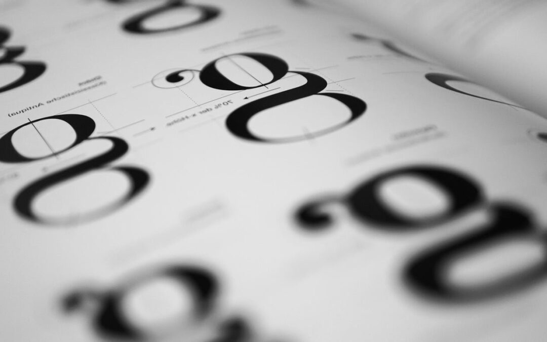
How to Pair Fonts for Brand Identity: A Designer’s Practical Guide

How to Pair Fonts for Brand Identity: A Designer’s Practical Guide

by Ernesto Orozco | Jul 12, 2026 | Uncategorized

Font pairing is one of those design decisions that looks effortless when it works and painfully obvious when it doesn’t. For brand identity projects, the typefaces you choose carry as much meaning as the logo mark itself. They whisper (or shout) what your brand...

« Older Entries

Recent Posts

  • RGB vs CMYK: Why Your Colors Shift Between Screen and Print (And How to Fix It)
  • What Is Prepress? The 9 Checks Every Designer Should Run Before Sending Files to the Printer
  • How to Set Up Bleed, Trim and Safety Margins for Business Card Printing
  • Gestalt Principles in Logo Design: 7 Real Examples That Prove Why They Work
  • How to Pair Fonts for Brand Identity: A Designer’s Practical Guide

Recent Comments

No comments to show.

BAS Big Graphics, we believe that collaboration is key. We will work closely with you throughout the design process to ensure that your vision becomes a reality.

Contact Info

BAS Big Graphics
[email protected]
402 Elk Creek Road, Chamblee, GA 30341 USA

Quicklinks

What We Do
About Us
News
Contact

Subscribe Now

Copyright © 2022 BAS Big Graphics. All Rights Reserved.

Personal Data | Terms & Conditions